Phoebe Portfolio

Dark Order
During my second year at university, we had a group project where we had to make a fictional show that appealed to a young audience. This show would only be in concept as what we had to produce would be the basic synopsis of the show, a rundown on what the show may look like and its target audience.
However, we was told to imagine if this show had existed for a while and is ana already established property. We would show this with a timeline of the history of our theoretical show and subsequent media/events. We would also be tasked with making transmedia products of this intellectual property we had made and it was my task to visualise the characters, logo, merchandise and more.

This is the main character of the show. He is Sonny, the son of Cthulhu who rules the monster world. Sonny, is not like his father and wants to have fun and make friends.

This is Ken. He is a cyclops and the best friend of Sonny. He loves to play basketball and he acts before he thinks, getting him in trouble often.

Nyarlathotep is the headmaster of the school Sonny and Ken attend and is the main antagonist of the show. The smoke that forms his head changed colour to represent different feeling and emotions like red for anger and blue for sadness.
This is the main character of the show. He is Sonny, the son of Cthulhu who rules the monster world. Sonny, is not like his father and wants to have fun and make friends.
Other Characters
During this project, many team members came up with many different character ideas all based on monsters and creatures from mythologies from around the world, one in particular really wanted a vampire in the final proposal. These are some of the other character drawn in concept.
The giant skeleton is based on the giant skeleton from Japanese folklore named Gashadokuro formed from the spirits of those who died in battle. Gashadokuro served as the security of the school the story is set in. Cerberus was thought up to be a teacher whose hands are two dog heads - some angry and the other silly. He has a hard time picking things up without them getting wet. There is also a Chimera in the bottom left and the pet of Sonny as well as a Ghoul from Arabic mythology and a Vampire who serve as minor antagonists in the story.

Merchandise
Transmedia was a big focus with our group when it comes to the art-side of the project. I would design different forms of merchandise fans could buy that is related to the show.
The first, and my favourite merchandise I had designed would be the plushies of the characters. As the shows target audience are children between the ages of 6-12, we decided to make the plushies cute and appealing to a younger demographic. These plushies can also be appealing to adults who likes there aesthetic. The button eyes were inspired by the movie Caroline and is the plushies core feature.

The next merchandise we decided to make would be apparel in the form of shirts with the faces of the main characters on. The concepts of these are very simple yet would be merchandise that would benefit in the form of sales financially as people love to represent the media they enjoy.

A T-shirt design with the shows logo.
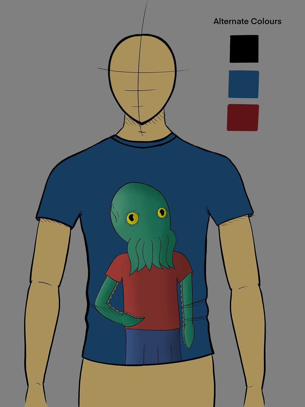
A T-shirt design with a Sonny print.

A T-shirt design with a Nyarlathotep print.
A T-shirt design with the shows logo.
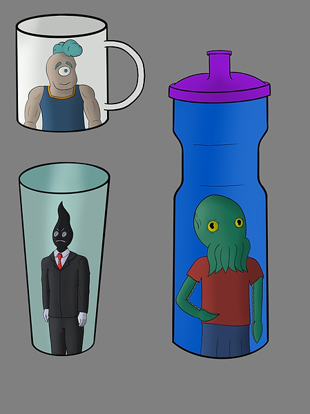
The next form of merchandise focus on a hydration initiative aiming to promote drinking water in young people - both to hydrate regularly, but also making a healthier choice in drinking water rather than fizzy and sugary drinks. The designs of these are simple in concept like the T-shirts, but the main appeal would be to represent the characters and series these children enjoy.
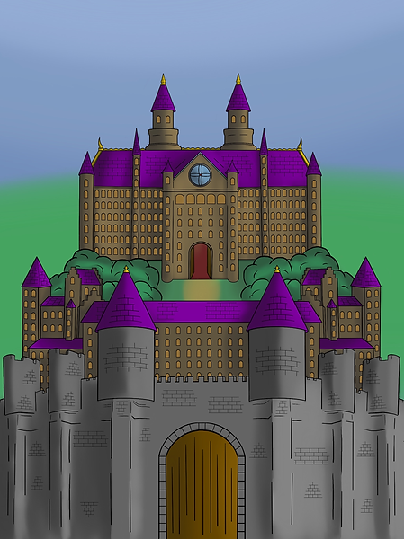
The design of the school these characters attend was the next focus for the merchandise side of the project. While it is good to visualise the main setting of the show, the illustration of the school would be used as the cover for the video game release. The game logo would sit at the top center of the piece. The video games release would be planned to take place a couple of years after the first season of the show. The show is a success of course!
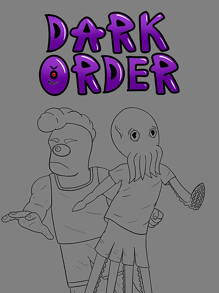
Finally, I was tasked in making a poster for the show and the intellectual property we had created. Due to the deadline approaching, I was unable to finish the piece, but I wanted to include it anyway. These posters would be put up on the advertisement screens at bus stops, train stations and the underground as well as on billboard.